Using Layout
In user interface (UI) design and development, Layout serves as the foundation of the UI structure. Its primary purpose is to arrange and distribute various elements (such as text, images, buttons, input fields, etc.) on the interface, ensuring that the content is clear and well-organized.
Import Layout Classes
- VBoxLayout: A vertical layout for stacking components vertically.
- HBoxLayout: A horizontal layout for arranging components side by side.
- FormLayout: A layout for creating form-like structures, typically with labels and input fields.
- Alignment: A utility for aligning components within a layout.
import { Desktop, VBoxLayout, HBoxLayout, Button, FormLayout, Edit, Alignment, TextEdit, ComboBox, SpinEdit } from 'wui.basic';
import "./theme";
Creating a Complex Layout with WUI
We'll now use these modules to create a structured layout. The final layout is organized as follows:
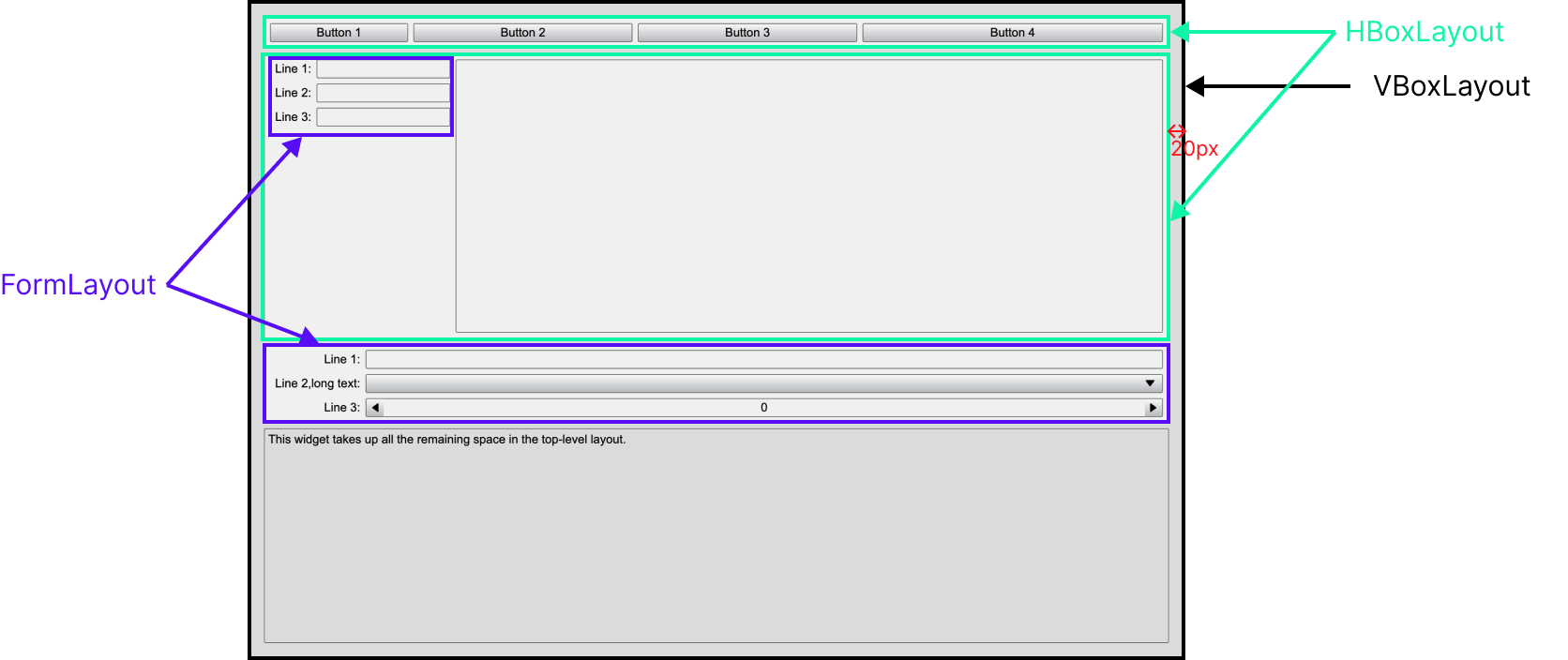
-
Outer layer: A vertical layout(VBoxLayout) serves as the container for all other components. This layout has a 20px margin around all four sides, ensuring a clean and spacious look.
-
Inner Components:
- Two horizontal layouts (HBoxLayout) stacked one after another.
- A form layout (FormLayout) for organizing label-input pairs.
- A basis text-editing component (textEdit) placed at the bottom.
Step-by-Step Implementation
Creating a Vertical Layout (VBoxLayout)
Start by creating a VBoxLayout as the outermost container. Set a 20px margin around all four sides to provide spacing between the layout and the window edges.
const desktop = Desktop.instance();
const mainLayout = new VBoxLayout(desktop);

mainLayout.css = { padding: '20px' };
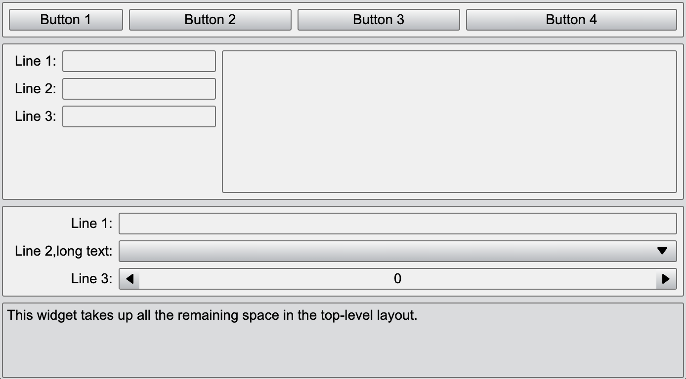
Add Two Horizontal Layouts (HBoxLayout)
Inside the VBoxLayout, add two HBoxLayout components. These layouts will arrange their child components horizontally, side by side.
Here only show how to add the first HBoxLayout. Inside this horizontal layout, we will add four button components, which will be arranged horizontally from left to right in sequence.
{
    // add a HBoxLayout
    const hLayout = new HBoxLayout(mainLayout);
    // set its appearance to panel, making it look like a panel
    hLayout.addClass('Panel');
    mainLayout.setStretch(hLayout, 0);

    const button1 = new Button(hLayout, 'Button 1');
    // set the button's horizontal stretch ratio
    hLayout.setStretch(button1, 1);
    const button2 = new Button(hLayout, 'Button 2');
    hLayout.setStretch(button2, 2);
    const button3 = new Button(hLayout, 'Button 3');
    hLayout.setStretch(button3, 2);
    const button4 = new Button(hLayout, 'Button 4');
    hLayout.setStretch(button4, 3);
}

Add a Form Layout (FormLayout)
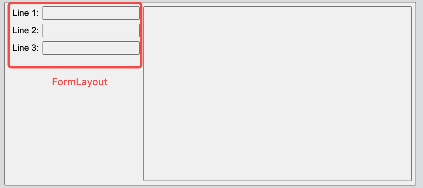
Next, include a FormLayout within the horizontal layout. The form layout is essentially a two-column vertical layout: the left column contains the names of the components, while the right column contains the components themselves.
Additionally, we can use the setAlignment function to specify the alignment of the form layout within the horizontal layout, such as aligning it to the top.
{
    const hLayout = new HBoxLayout(mainLayout);
    hLayout.addClass('Panel');

    const formLayout = new FormLayout(hLayout);
    formLayout.addItem('Line 1:', new Edit());
    formLayout.addItem('Line 2:', new Edit());
    formLayout.addItem('Line 3:', new Edit());
    mainLayout.setAlignment(formLayout, Alignment.Top);

    new TextEdit(hLayout);
}
The following five alignment options are supported:
declare enum Alignment {
    Top = 0,
    Bottom = 1,
    Left = 2,
    Right = 3,
    Center = 4
}